Hey Everyone, I have some new Images from this summer, I hope you enjoy.


Publish Post


 This one discusses our longing for something other than the uniqueness of ourselves and how maybe we should be satisfied with what we have because we might not know the whole truth of what we long for. (look at the top left corner)
 "And they had to burn the house down to rid us." This image is an illustration to the last line of a poem that discusses a bee infestation, and that line is also the title :).
 This one (above) will be featured in the winter edition of Creative Quarterly Magazine 10 which you should look for at Barnes and Noble because art is cool and there is going to be a lot of really great student work. This ones called "Before There was Blood on Her Finger," referencing the fairy tale Briar Rose, moments before she pricks her finger on the witch's spindle.
 "Bearer of Good News." This ones also from the Briar Rose series I had started. In the beginning of the story, the Queen is bathing, and a frog hops up to her and announces she is pregnant with a daughter. Peculiar but great. I left the top left open for the placement of text if it were to be published.
 Here I was re-experimenting with the use of newspaper for a collage element. I really enjoy the texture it adds to the viewing of the piece.
 The relationship between bliss and ignorance.
 The maternal relationship of "birds"
 The industrial/wildlife relationship
 "Beware of Cliff." This illustration is about being careful with the exposure of our hearts without thinking about what we might be doing, and the trouble thoughtless decisions could lead too.
 "The Buried Staircase." Here I was just beginning to explore collage, repetition of design, and the use of blank space to show depth. It really started the ball rolling for what I'm exploring now.
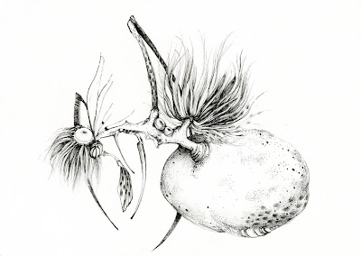
 This was my first pen and ink drawing since my freshman year, and while doing it I realized how much I love ink. I was trying to figure out how to create an entire image with limited rendering, detailing only specific areas and letting the eye fill in other less drawn areas.
 Just a painting for figure painting class, incorporating design elements.
 This was an attempt to combine wet oil paints and pen and ink. I learned some tricks and was interested in the natural textures and blotting of the oil and ink that the mineral spirits left.
 An illustration to a made up story. Here the girl is traveling across the lake inside of her living carriage. I did a series of these in different media, with the same main character. Maybe I'll post those later, though they ( this one included) are a bit outdated.